Triton Future Destination Series
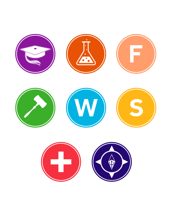
Icon Set
About
Leveraging the power of 160,000 UC San Diego alumni, the Career Services Center (CSC) integrated with Alumni and Community Engagement (ACE) in fall 2013. This bold move, one of the first of its kind at a major public university, created the opportunity to build a new model of career services for students and alumni alike.
Part of this groundbreaking move was a desire to reimagine the series of fairs hosted by the Career Services Center with a stronger brand identity. In total, CSC hosts eight fairs which include the Graduate & Professional School Information Fair; Science & Technology Job Fair; Triton Fall Job & Internship Fair; Law School Information Fair; Triton Winter Job & Internship Fair; Health School Information Fair; the Triton Spring Job & Internship Fair; and the Future Destinations Job Fair.
Traditionally, each of the fairs had their own look and feel, which ultimately was a disservice to CSC because it diluted the overall branding experience. The inconsistencies in look and feel made it difficult for students to recognize that the fairs were longstanding flagship events produced by the Center. Furthermore, the varied brand identities were so vastly different; it appeared there was no relation between each event.
Understanding this, bringing the fairs under a single series created a stronger brand presence, as each fair now referred to an identity much larger than its own contained event. It also provided us the ability to show the true breadth of fair opportunities that CSC provides the UC San Diego student community.
The first challenge was to find a way to unite the fairs without disrupting the distinction of “job” versus “graduate school” fairs. The Triton Future Destinations Series, made sense as graduate school and job opportunities were both possible destinations for students upon graduation. It was also fitting because the Future Destinations Job Fair was the last event of the academic year. The second challenge was to find a uniform way to identify each fair, and to visually communicate the dense information included with some the fairs. To address this, we took a minimalist approach to design and adopted a unified look and feel for all creative that was clean, easy to read and identify. Additionally, we created an icon for each fair that related to its industry. We utilized a distinct accent color for each event set against white and black tones to further enhance its own identity. The minimalistic approach provided enough room to vary the layout for each fair’s collateral (name badges, welcome letter, table tents, motion graphics, etc.), while giving enough distinction for each without deviating too much from the reimagined brand. In the end, our approach gave us a unified identity, while the icon and color-coding elements allow each fair to stand on its own.
